Table of Contents
Giới thiệu:
Nếu bạn đang sử dụng Bootstrap 3 thì chắc hẳn việc điều chỉnh để hiển thị button menu khi responsive thì bạn phải sẽ phải vào file less để sửa giá trị của biến @grid-float-breakpoint vì mặc định giá trị của nó là 768px (kích thước của màn hình thiết bị). Tuy nhiên việc phải custom vào trong file của Bootstrap là cách không được khuyến khích. Vì vậy lên Bootstrap 4 đã hỗ trợ các class cho việc custom theo các thiết bị. Chúng ta chỉ cần sử dụng các class có sẵn mà không cần phải sửa file của Bootstrap. Sau đây mình sẽ giới thiệu về các class đó.
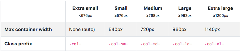
Như chúng ta cũng đã biết trong Bootstrap 4 có sử dụng các class cho các thiết bị là:
.col-sm-, .col-md-, .col-lg-, .col-xl- tương ứng với các thiết bị màn hình:
Hướng dẫn:
Tương tự với menu cũng có các class để điều hướng button menu hiển thị trên màn hình nào:
.navbar-expand{-sm | -md | -lg | -xl}
Nếu chúng ta muốn hiển thị button menu cho màn hình nào thì chỉ cần thay đổi class sm, md, lg, or xl.
- navbar-expand-sm = collapse on xs widths <576px
- navbar-expand-md = collapse on sm widths <768px
- navbar-expand-lg = collapse on sm widths <992px
- navbar-expand-xl = collapse on lg widths <1200px
- navbar-expand = expanded on all widths
Expand at xl.
Nếu bạn áp dụng class navbar-expand-xl cho thẻ nav như đoạn code minh hoạ bên dưới thì button menu sẽ hiển thị trên màn hình có kích thước < 1200px.
<nav class="navbar navbar-expand-xl navbar-light bg-light">
    <a class="navbar-brand" href="#">Expand at xl</a>
    <button class="navbar-toggler" type="button" data-toggle="collapse" data-target="#navbarSupportedContentXL" aria-controls="navbarSupportedContentXL" aria-expanded="false" aria-label="Toggle navigation">
        <span class="navbar-toggler-icon"></span>
    </button>

    <div class="collapse navbar-collapse" id="navbarSupportedContentXL">
        <ul class="navbar-nav mr-auto">
            <li class="nav-item active">
                <a class="nav-link" href="#">Home <span class="sr-only">(current)</span></a>
            </li>
            <li class="nav-item">
                <a class="nav-link" href="#">Link</a>
            </li>
            <li class="nav-item dropdown">
                <a class="nav-link dropdown-toggle" href="#" id="navbarDropdownXL" role="button" data-toggle="dropdown" aria-haspopup="true" aria-expanded="false">
                    Dropdown
                </a>
                <div class="dropdown-menu" aria-labelledby="navbarDropdownXL">
                    <a class="dropdown-item" href="#">Action</a>
                    <a class="dropdown-item" href="#">Another action</a>
                    <div class="dropdown-divider"></div>
                    <a class="dropdown-item" href="#">Something else here</a>
                </div>
            </li>
            <li class="nav-item">
                <a class="nav-link disabled" href="#">Disabled</a>
            </li>
        </ul>
        <form class="form-inline my-2 my-lg-0">
            <input class="form-control mr-sm-2" type="search" placeholder="Search" aria-label="Search">
            <button class="btn btn-outline-success my-2 my-sm-0" type="submit">Search</button>
        </form>
    </div>
</nav>
Expand at lg.
Bạn chỉ cần thay đổi class navbar-expand-xl thành navbar-expand-lg thì button menu sẽ hiển thị trên màn hình có kích thước < 992px.
<nav class="navbar navbar-expand-lg navbar-light bg-light">
Expand at md and sm.
Tương tự với lg
Never expand.
Một trường hợp đặc biệt là nếu bạn muốn luôn luôn hiển hiện button menu thì bạn chỉ remove class .navbar-expand như sau:
<nav class="navbar navbar-light bg-light">
Always expand.
Nếu bạn muốn luôn luôn hiển thị tất cả các menu nghĩa là không có button menu khi responsive thì bạn chỉ cần thêm class navbar-expand như sau:
Kết Luận:
Với việc sử dụng các class như trên thì việc custom cho menu responsive sẽ rất dễ dàng. Hy vọng với bài viết này có thể giúp ích cho bạn. Nếu bạn là một front-end hoặc chuẩn bị ra trường muốn làm việc tại vị trí front-end. Vui lòng gửi CV tại đây https://bit.ly/css-developer-2018.
DEADLINE: Chúng tôi sẽ dừng nhận CV ngay khi tìm được người anh em chung chí hướng! Vậy nên hãy hành động ngay trước khi đánh mất cơ hội của mình nhé.
Cám ơn bạn đã ghé thăm!
 Previous post