Today’s web design has truly opened up a creative paradise beyond its time, thanks to the development of technology and continuously evolving trends. However, when researching products targeting the Japanese market, I noticed a tremendous difference, almost comparable to the rest of the world. So why do I need to research products for this market when working on the product design team for themes on the Shopify platform?
According to statistics and observations from the Marketing department, Japan is an emerging market. It is estimated that revenue will continue to grow strongly in e-commerce in the coming time. The product team sees the potential and opportunity for improvement to introduce the company’s flagship product into this market, researching to tailor it to suit the needs and preferences of Japanese consumers. My role, as a Product Designer responsible for Visual Design, is to provide interface and user experience solutions for end users, ensuring that our designs not only align with aesthetics but also meet the expectations and attract customers in the Japanese market for the company.
This article will share the process of researching web design trends in Japan and how I found that culture has gone beyond the realm of technology or trends, forming distinct characteristics from conventional design standards to propose suitable solutions.
Exploring Common Characteristics of Japanese Web Design
Japanese web design possesses unique features rarely found in Western products. To develop effective Visual and UX solutions, my colleagues and I conducted extensive research to identify elements that could be translated into design models suitable for user experience.
Research does not necessarily have to start with a field trip to Japan; most information today can be gathered online. However, if possible, real-world surveys and prototype testing would provide more accurate results for product outcomes. Nonetheless, in the context of businesses needing to consider cost efficiency, a Product Designer must rely on primary and secondary research to truly understand user needs and behaviors before proceeding with design.
Desk Research
Desk research involves collecting data and information from existing sources without the need to conduct surveys or collect information directly from subjects but rather through analyzing and synthesizing information. This method is quick and cost-effective, helping me gain an overview before delving into deeper research methods.
I’ll share the three main stages of this process:
Step 1: General Research
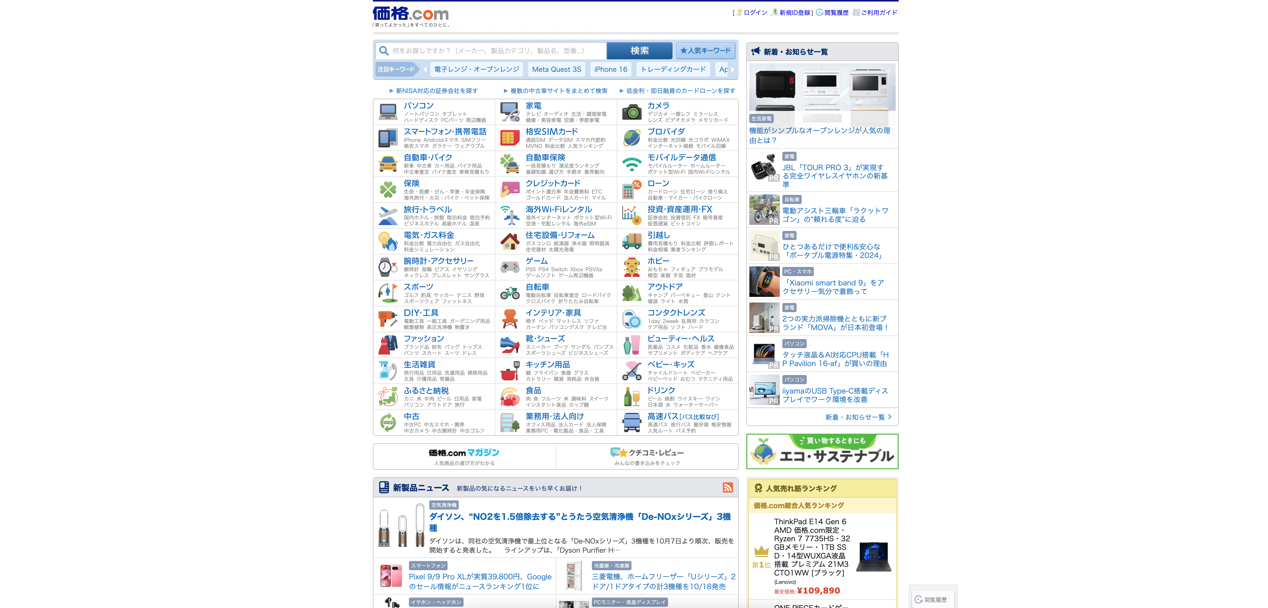
To understand the initial shape of the most popular websites, start by exploring the ones with the highest organic search traffic in Japan. This doesn’t necessarily mean all Japanese websites are designed like them or that they are inherently good.
You can search for “Top 100 most visited websites in Japan,” and the tool will guide you to the desired destination. Refer to sources like Ahrefs. After that, select a few websites ranked at the top and in the middle. Take a look and examine these sites to identify popular characteristics.
Step 2: Tailor Research Based on the Domain You’re Designing For
A Product Designer needs to collaborate with stakeholders continuously, quickly, and throughout the project to receive research insights in the field. You can also conduct quick research yourself by searching: “Top 100 Shopify Stores in Japan 2024,” then dig deeper, analyze, and identify the main points you need to follow.
Step 3: Synthesize, Analyze
In this project, I used the 2×2 matrix tool for the initial step of collecting visual samples to gain an initial sense of the Japanese style.
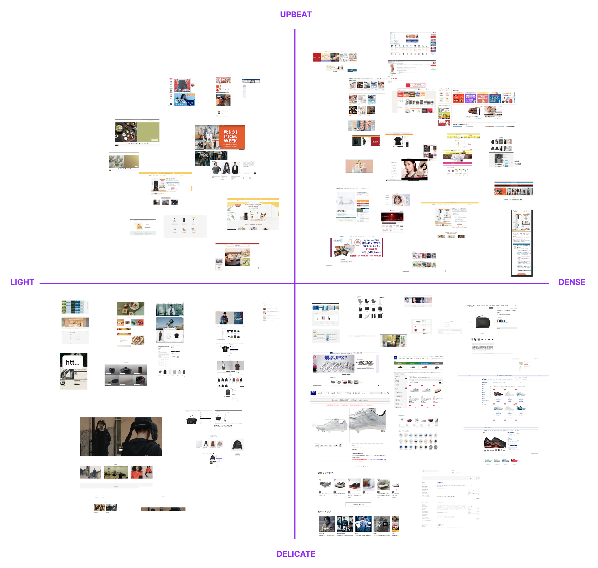
I identified two extremely distinct trends when observing the samples and evaluating the target users these two design directions serve.
Traditional Design Trend:
- A significant amount of text and detailed information is provided upfront.
- Less whitespace within content.
- The website’s content aims to support purchasing decisions rather than creating an emotional connection.
- Various scripts are used, including vertical and horizontal text.
- Smaller and more frequent images are used rather than large high-resolution images.
- Data, customer reviews, and statistics are prioritized on landing pages to build user trust.
- Many contrasting colors and design elements are often used within small sections.
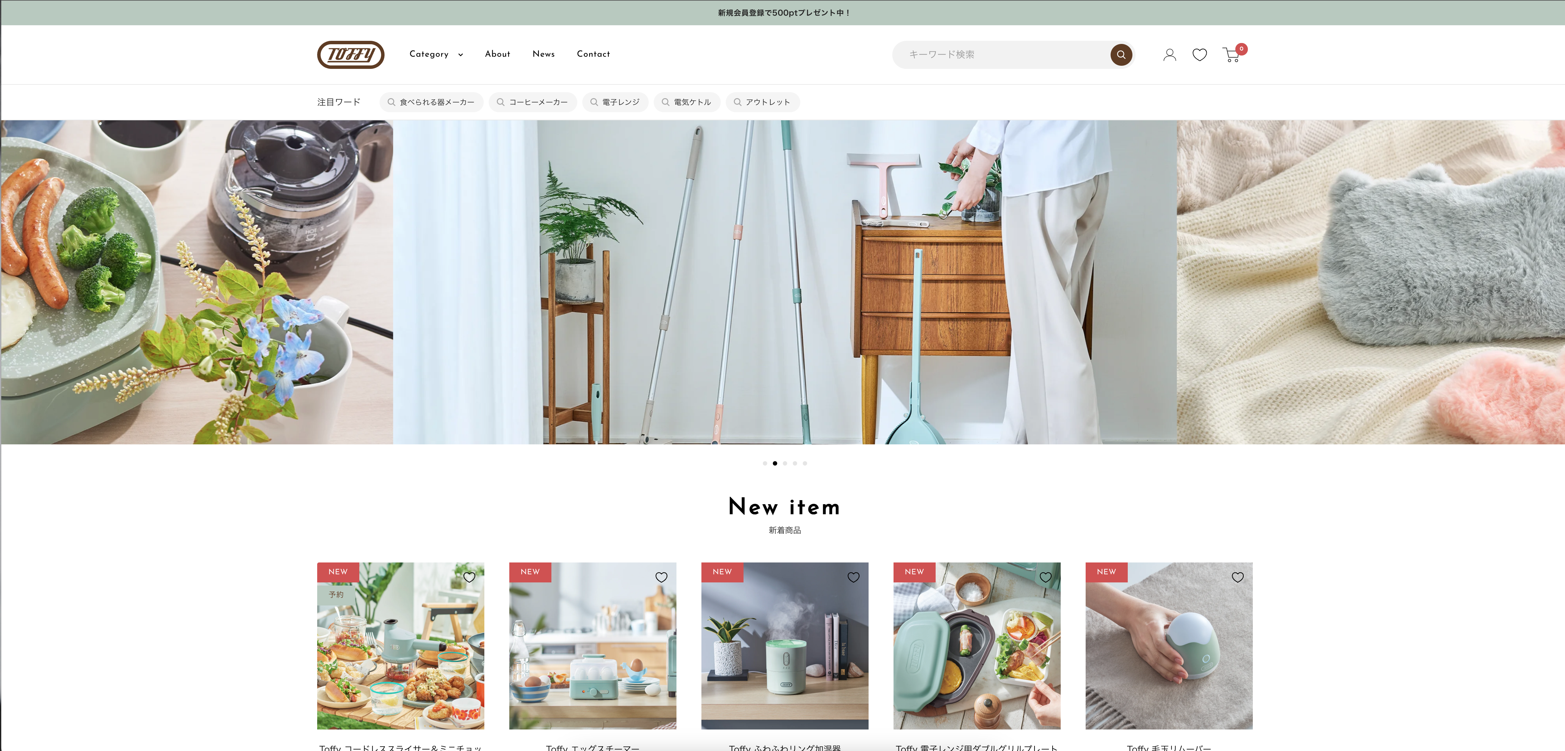
Modernized Trend:
- Less dense, cluttered information but still provides clarity upfront.
- More whitespace within design elements.
- Content aims to convey a story and evoke brand spirit.
- Uses large, high-resolution images with no graphical text on them.
- Customer reviews and interactive social media links are given priority on landing pages to build user trust.
- Uses muted background tones mixed with one or two brand colors.
The findings from this research not only helped me gain a deeper understanding of Japanese user preferences but also allowed me to create effective visual designs that suit their needs and culture.
Why is Japanese Web Design So Distinct from the Rest of the World?
Understanding popular and easily recognizable characteristics in Japanese web design is an important step, but it is still not enough for me to come up with an optimal design solution. For a Product Designer, the key is not only understanding what but also exploring deeper into why those design decisions were made. Only by grasping the true reasons behind these decisions can I develop design solutions that provide the most value to users, suitable to their needs and expectations.
1. Eastern And Western Thinking Culture
“The lens through which your brain sees the world shapes your reality” – Shawn Achor
1.1. Holistic Thinker:
In a study titled “How Much Information? East Asian and North American Cultural Products and Information Search Performance,” researchers pointed out that East Asian visual culture products tend to contain more information. Instead of clearly separating main and peripheral information, East Asians tend to perceive all elements within the overall context. This is reflected in the fact that Japanese people can gather up to 60% of information from context and double the amount of information related to relationships and interactions between elements. This approach helps them process information more comprehensively compared to Westerners.
1.2. Analytic Thinker:
In contrast to Holistic Thinkers, Analytic Thinkers often clearly classify between primary and secondary information. They focus on prominent, core elements and discard peripheral information, making the content more concise and succinct. Their way of thinking emphasizes separating elements and considering them as independent units. This distinction between primary and secondary information becomes clearer, while Holistic Thinkers view things as tightly interconnected and inseparable.
2. The Linguistic Challenge
2.1. What a big character set!
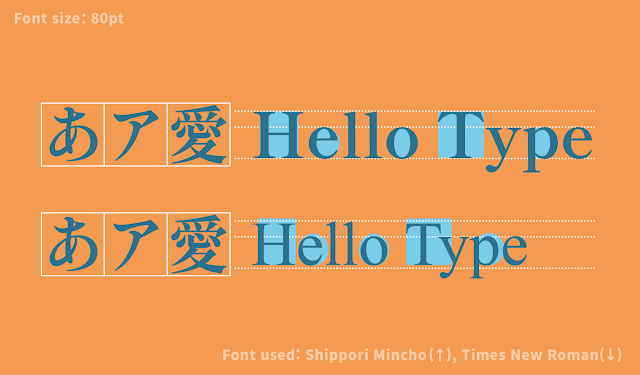
The Japanese language uses a large number of characters due to the combination of three writing systems—Hiragana, Katakana, and Kanji—along with Latin letters and Arabic numbers. Kanji alone can contain over 23,000 characters, making the Japanese character set significantly larger than that of languages using the Latin alphabet, where the typical font may have around 500 characters. This massive character set directly affects web design, especially in terms of performance and font selection.
Reference: Google Fonts Blog
One of the biggest challenges is page loading speed, as Japanese font files can exceed 2 MB due to the large number of characters they must support. Designers often need to balance aesthetics with practical concerns such as loading time, which can affect user experience on slower devices or networks. This often leads to using more “web-safe fonts” that are pre-installed on most devices, such as Meiryo or MS Gothic.
2.2. Typography hierachy
Moreover, Japanese typography is complex and differs from Latin-based design rules. The lack of capital letters and variations in line spacing and whitespace can make Japanese web designs seem more “crowded” to those unfamiliar with the language.
A typical Latin font has characters with different widths, but Kanji is designed to fit within a square space, meaning they are much wider compared to most Latin characters. This means that a typical Latin font might appear too narrow when mixed with Japanese characters. To allow Latin text to blend with other scripts in Japanese documents, Latin fonts are often adjusted to be slightly wider, with shorter ascenders and descenders, and thicker stems. Besides these adjusted Latin fonts, Japanese fonts also include “full-width” Latin characters.
Reference: Google Fonts Blog
3. Risk Avoidance Culture
A common story among American designers when they start designing for Japanese users is that Japanese web forms are often so complex they are hard to understand.
In an interview with Brandon Hill, CEO and founder of btrax, he encountered this situation while managing the country office for an American startup called Engine Yard. They provided platform-as-a-service (PaaS) deployed on Amazon, Google, or Azure. In the U.S., they had a simple six-step user guide—efficient and easy to understand. However, when they localized the platform for the Japanese market, the feedback was very different. Japanese users didn’t like the step-by-step guide at all. Instead, they preferred a comprehensive form with around 70 data fields and checkboxes, allowing them to configure everything from the start. Initially, Brandon’s team was skeptical, but after testing with a small group, they found that Japanese users genuinely preferred this approach. When asked why, users said they liked to know all the requirements upfront. Their approach was to read through the entire form from top to bottom, then go back and fill in the information from the beginning.
4. Demographic Considerations
After the war, Japan began Westernizing, which led businesses to focus more on profit and drove the development of cities like Tokyo. Rather than traditional community bonds, post-war Japanese society shifted towards economic development, creating a busier and more hectic pace of life in urban areas.
This indirectly influences web design styles but directly affects the habits and behaviors of Japanese people. You can easily recognize a Japanese person in any country by their formed habits: they exude a sense of urgency, busyness, quickness, but also caution. Therefore, when designing any solution, understanding the user’s context, persona, and habits to accurately simulate their environment is essential, helping them feel comfortable and confident about the quality of the product.
Challenges in Entering a Unique Market
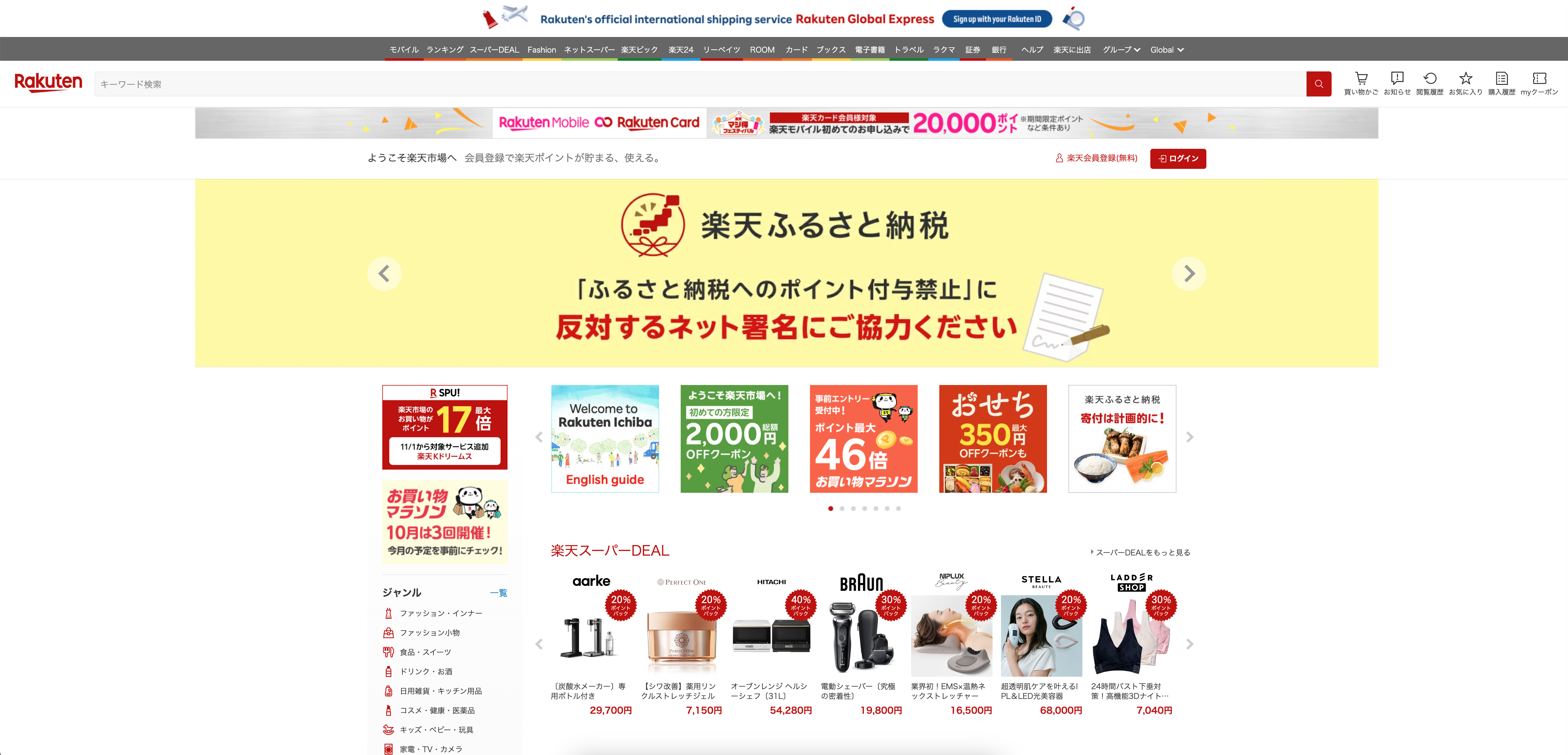
One of the biggest challenges in designing for the Japanese market is adapting to their unique visual style and website usage experience. Aesthetic trends that have succeeded in other regions may not yield the same results here. For example, Japanese websites often contain a lot of information, relying on both images and text to convey value simultaneously. This approach may seem cluttered to users accustomed to minimalist interfaces in the West, but in Japan, it works effectively as it aligns with their consumption habits.
Understanding this is crucial to us. Instead of imposing Western design standards, we have made efforts to study, adapt, and learn from the favored interface styles in this country.
Step by step building design to serve the Japanese market
An effective visual-oriented web design needs a clear and cohesive direction, built upon critical factors such as user needs, business constraints, and market context. Below are some key factors that I have researched and concluded when designing interfaces and user experiences for the Japanese market.
1. Define Visual Direction
1.1. Dense Layouts
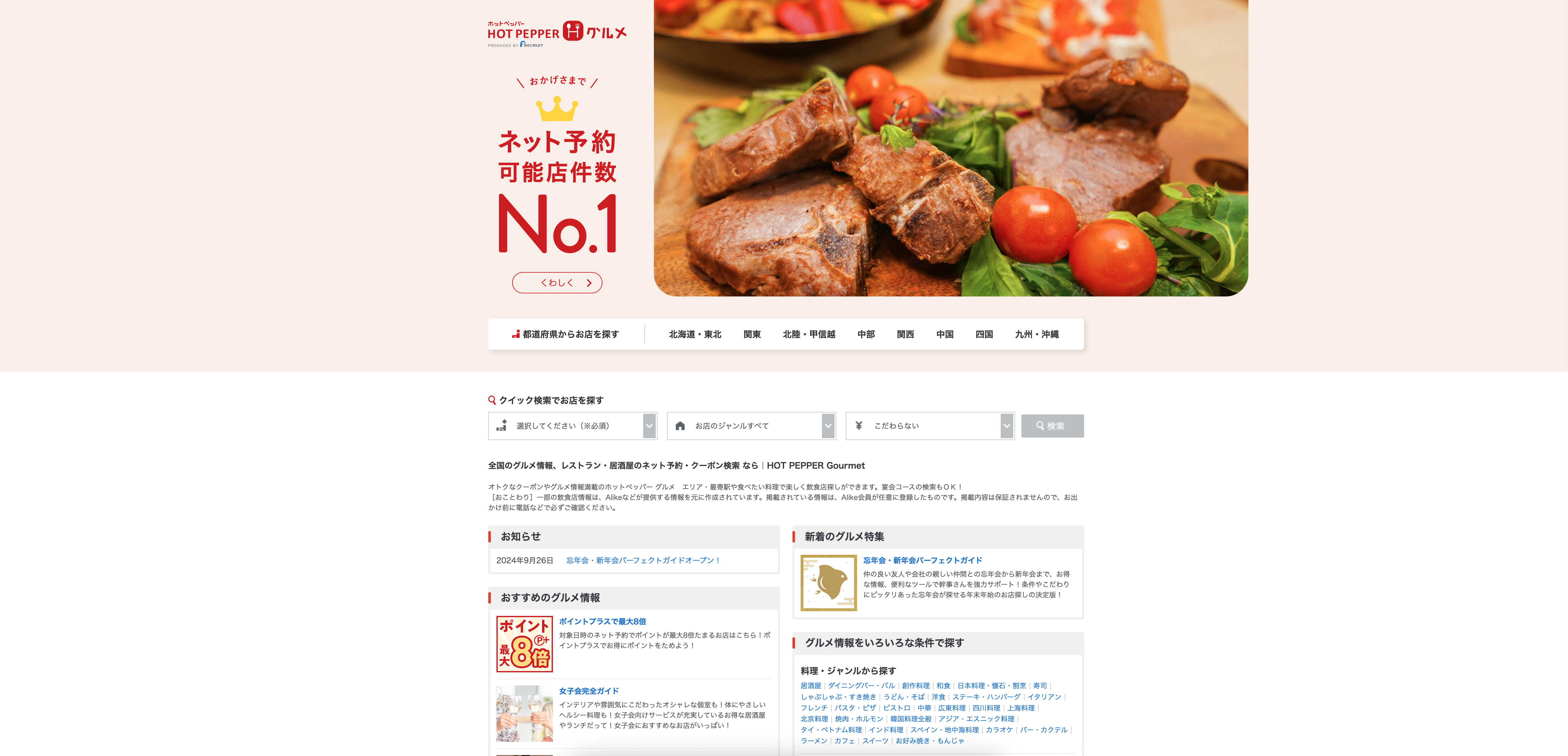
Dense layouts: The visual/UX direction needs to reflect Japanese users’ habit of quickly and comprehensively grasping all information without having to click through many other pages. Japanese websites often display much information right on the homepage, filled with links, banners, and text, making the site appear quite busy.
Tech-heavy design: The visual should convey reliability through numerous small text sections paired with images, providing enough details for users.
Whitespace: The visual should convey busyness or minimalism through flexible use of whitespace.
If you want it to look busier, the spacing within elements often becomes very narrow. Instead, the two large side spaces create an indirect reason for limited room to present information. One explanation I find is that it is heavily influenced by culture. The sense of security, even in digital products, Japanese people often like to use printed publications. Therefore, a compact interface resembling a well-organized magazine might give them a sense of comfort.
1.2. Japanese-style Minimalism
On the other hand, if you want to pursue minimalism in design, reduce the amount of information and visual weight of the elements you use, and side spacing will still help you achieve both goals differently. This is also one of the design solutions we studied, allowing users to adjust ‘max-width’ on the website, making it easier to establish a suitable website with large side spaces, gradually making our products accessible to this market with similar solutions based on research into their preferences and habits.
2. Color Palette
When choosing colors to approach the Japanese market, carefully considering the customer base and product is essential. Below are some tips to keep in mind when selecting color schemes to start creating a visual direction:
2.1. Aiming for connection and reminiscence:
Traditional cultural elements like Ukiyo-e paintings, print design, and Kimono color combinations are masters of color schemes. They are not only long-standing cultural symbols but also inspire systematic and tightly combined colors, reflected through product quality. Using characteristic color schemes like red, black, teal, and gold can evoke nostalgia, reminiscent of Japan’s deep cultural values. These colors are not just colors but also symbols of respect for the country’s history and heritage.
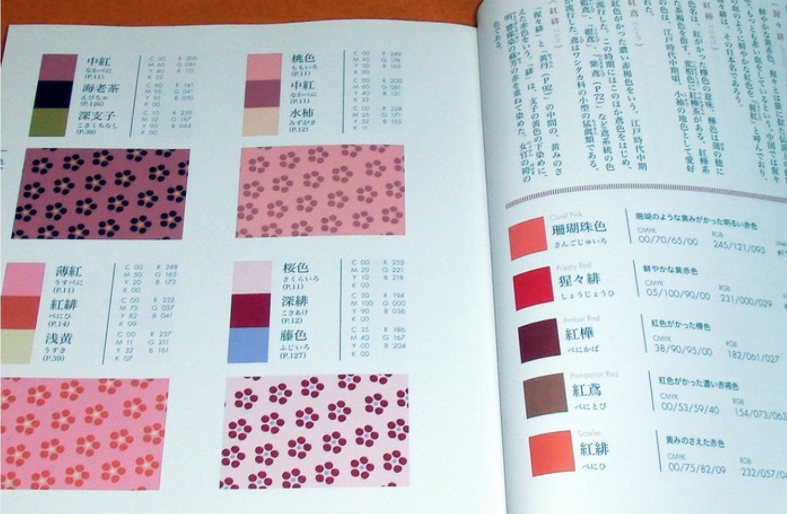
2.2. Aiming to create connection with modern spirit:
To make the design vibrant, lively, and reflect modern style, use vibrant color palettes like red, pink, yellow, orange, purple, and green with high saturation. These colors are reminiscent of neon signs glowing on the bustling streets of Tokyo or Osaka. The combination of vibrant colors not only creates a sense of urgency, liveliness, but also brings a sense of stimulation and energy, consistent with the fast-paced and dynamic spirit of modern Japanese visual culture.
2.3. Aiming for minimalist and high-end aesthetics in design:
When pursuing minimalist and zen-like styles, focus on using a monochromatic color scheme combined with a white background and black text. This minimalism not only reduces complexity and crowding but also brings a sense of calm and sophistication, inspired by the “emptiness” philosophy of MUJI. This philosophy emphasizes the internal appeal of objects through the elimination of unnecessary elements, focusing on the core essence of design. This style embodies the “su” philosophy – simple yet full of sophistication – a significant aspect of traditional Japanese aesthetics, where simplicity not only reflects humility but also honors the attraction that transcends the concept of luxury.
3. Typography
3.1. Choosing Uppercase When Combining Latin Letters with Japanese Script
When examining Japanese websites, I noticed a tendency to use uppercase for short headings when combined with Latin letters. Based on prior research on alphabet characteristics and compatibility in design, I opted for uppercase in titles to create visual balance with Kanji characters, which are typically enclosed in a square frame. Uppercase letters have a height almost equal to their width, providing uniformity in size. This helps English words seamlessly blend into the overall layout while maintaining a sense of hierarchy and contrast, enabling users to quickly identify important sections amid Japanese characters.
3.2. Choosing a Suitable Typeface
Additionally, thoroughly checking multilingual-supporting fonts, especially those specifically designed for Japanese, is crucial. You wouldn’t want to experience a webpage where local characters are displayed incorrectly or lack aesthetic appeal due to font errors, as this could directly impact the perception of professionalism and trustworthiness among users.
4. Imagery
The use of imagery should be flexibly adjusted according to the target customer segment. If you aim for a mass-market segment in Japan, ensure that the images are clear and information-rich, effectively conveying the important details that users expect.
Conversely, if you’re targeting a zen, minimalist style, or premium brands, particularly in fashion, prioritize image quality. In this segment, images are not merely supplementary but also vital elements showcasing the brand’s investment and sophistication, meeting user expectations for refinement and high-end quality, not only in Japan but universally.
5. Other Visual Patterns
•Limited Use of Corner Radius in Design: In Japanese web design, containers often lack large rounded corners as seen in popular Western card designs. Using more angular or square corners helps create a serious, professional, and formal feel. This also aligns with the concept of precision and clarity in Japanese culture, where design elements aren’t “softened” by excessive rounding.
•Flexible Use of Lines and Dividers: Some Japanese websites use lines to clearly divide content sections, creating structure and making it easy to follow. However, there are designs that eliminate dividers entirely to maximize empty space, creating a seamless and airy interface. This approach is often combined with dense information arrangements to avoid a cluttered look, balancing content with whitespace.
•Attention to Information Hierarchy: Japanese websites sometimes lack clear hierarchical division between content sections such as headings, main content, and sub-content. All elements might be displayed at once, allowing users to navigate and identify important information without relying on an overly segmented layout. This reflects a holistic approach where all information is considered important and interrelated.
In Conclusion
Although certain cultural factors may profoundly influence design solutions, I find that they should never be deemed good or bad. The key lies in understanding user preferences and experience expectations rather than solely focusing on the designer’s perspective, ensuring the product operates effectively.
“You are not users” – every designer might say.